For the latest version of Epilogue, we’re experimenting with an updated design on the book details screen, with a background color or pattern that matches the book cover. I’ve been wanting to do something like this for a while, to make the app feel a little more alive. There’s a lot of gray otherwise.
Here are a couple screenshots of what it can look like, with a pattern based on the content and style of the book cover:
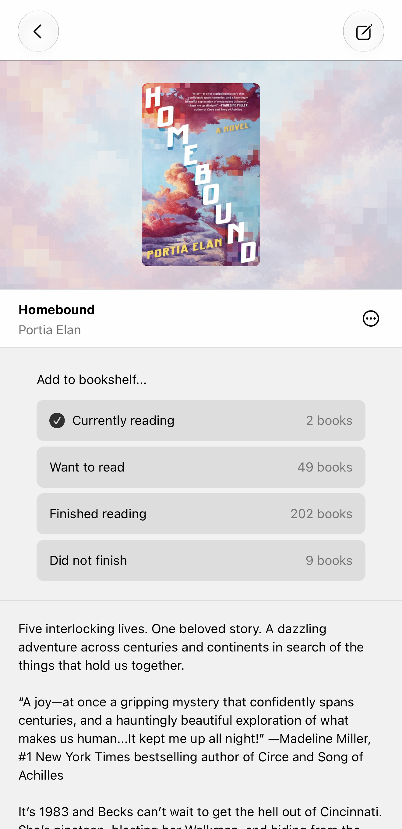
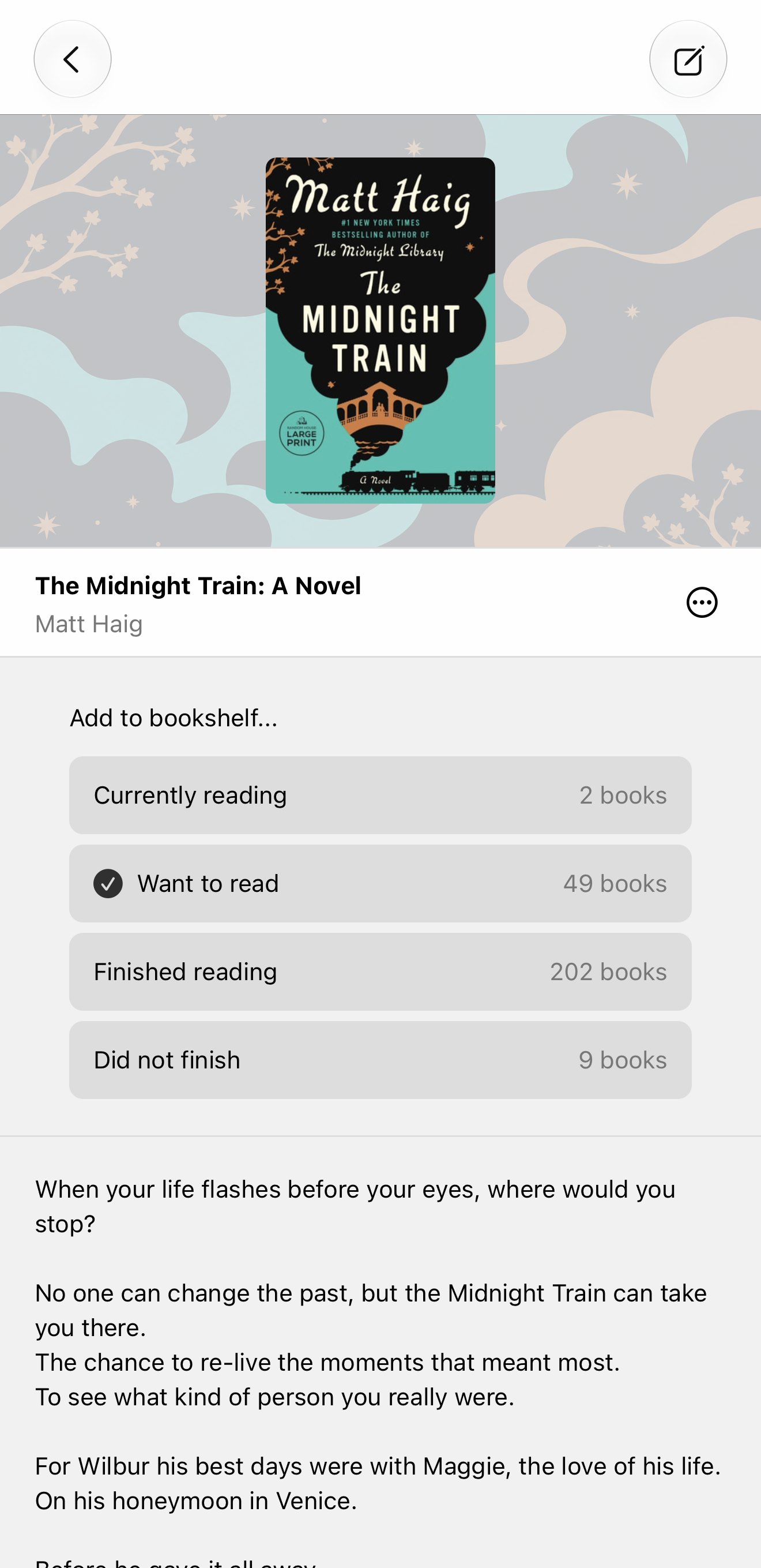
I really like how these look. The background images are generated with AI, so I want to be transparent with the community about my thought process behind this.
Micro.blog has had a fairly restrained adoption of AI. We mostly use it for the easy wins, like generating accessibility text for photos or transcripts for podcasts. I’ve also written a strategy blog post to guide where we should use it in the future, so we don’t needlessly throw AI everywhere.
What makes this new Epilogue feature interesting is that it’s effectively generating new art based on the book cover designer’s own art. On the one hand, you could argue this should be the work of a human artist. We want to support artists and this feature might be at odds with that. On the other hand, painting thousands or millions of abstract images to supplement a book cover is not realistic. The feature just wouldn’t exist without AI.
For my first pass at this feature, I generated a new image of the cover but without any of the text. This worked surprisingly well, but it felt too much like a copy of the original work. By using a more abstract image, it’s further removed from the art, and so feels like creating a complementary design rather than reproducing someone else’s work.
The abstraction also works better visually. It supports the book cover instead of competing with it. And the backgrounds are dimmed out so they don’t distract from the covers.
When I redesigned the Micro.blog home page with paintings, I made sure they were all actual paintings by humans, not AI generated. I paid for them via Adobe’s catalog of licensed artwork. I want Micro.blog to have some beauty, some personality, a feeling that matches its small community of human bloggers.
I see the irony in that the new book background patterns match this human feeling I’m trying to convey for the platform yet are only possible with AI. I sat on this idea for a while, trying to explore the ethics of it, before ultimately deciding it’s the right tradeoff. For Epilogue to be successful and bring more people to blogging, it has to be great in all the ways that Goodreads is lacking: more open, better design, simpler.
Another philosophical argument against AI is that it is trained on all the world’s knowledge, but who benefits? In this case, I think the generated background primarily serves the book itself. The background is there to complement the original artwork, not replace it, and to make the book feel more inviting.
A related question is whether having our own art to supplement a book will confuse users into thinking the design is officially part of the book publisher’s marketing. It’s similar to how Apple will have their own artwork in the App Store based on third-party app icons. Sometimes they ask third-party developers for artwork, and sometimes they use their own thing.
As with all our AI-related features, these images are only generated if you have AI enabled on your account. If AI is disabled, Epilogue falls back to simple background colors using unremarkable non-AI code.
These new images can also power new features, such as the book calendar on my own blog. The new images really shine here.
If you have any thoughts, let me know. These images are currently disabled except for a handful of books. I will enable them first only for the books I’m reading, then popular books such as New York Times bestsellers, then reflect again on how broadly to roll them out.