Everyone complains about software bloat. And it’s easy to see why — applications are bigger and slower than they’ve ever been, and users think the dozen features they will never use are to blame.
On the Mac we are lucky to have a large number of great, small, focused tools that solve a few problems well. The best of these become successful, but what then? You have to keep adding features. How do you control the software so that it becomes even more useful without feeling too packed?
One way is to differenciate between visible and hidden bloat. For example, Microsoft products used to have a tendency to take every major bullet point on the side of the box and make a toolbar icon for it. Even if the user only uses 5% of those features, they have easy access to far too many of them, and they needlessly have access to them all at once.
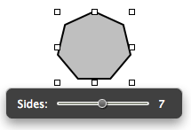
 Instead, adding features in context allows the application to grow without feeling too busy, and without distracting the user from the core set of features they are familiar with. The new user interface is discovered by using a new feature, and otherwise remains out of sight.
This point was really emphasized for me while using Keynote 3 the other day. I love the contextual floating slider when editing a shape (see image). They could have put this slider in the inspector window, but it is so infrequently used it would have remained disabled most of the time, and cluttered those panes with little benefit.