Today we launched a design update for the Micro.blog web interface. Vincent has been working on this with a focus on the mobile interface especially, and it looks great on the iPad as well.
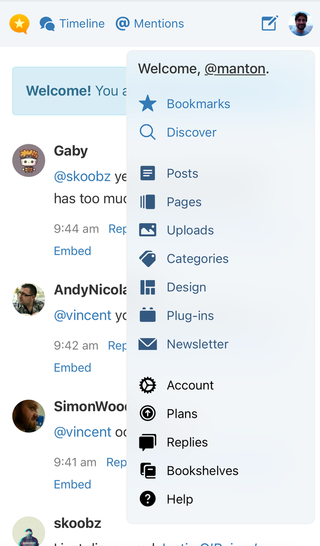
In the previous version, when viewing on mobile the sidebar would collapse and you’d get a hamburger menu that was clunky to use. Now, the most important menu items like Timeline, Mentions, and Discover will move to the header, with a new popover menu for accessing other features.
You can see the new layout even on desktop by just resizing your window smaller. Here’s what the header looks like on tablet and at small desktop window sizes:

And on the iPhone, with the new popup menu open:
We are very excited to roll this out. The iOS and Android apps will always be a great choice for posting or checking replies, but they can’t do everything the web version can do. The web version of Micro.blog is now much nicer to use everywhere.